Budget like an African Super Mum
“Budget like an African Super Mum.”
A one-week interview concept — a mobile-first personal finance platform designed for real African users, starting with budgeting, expense tracking, and savings goals.
The brief:Design a comprehensive personal finance management app providing tools for budgeting, expense tracking, savings goals, and insightful reports — catering to users with varying financial literacy levels.
Managing money in Africa is harder than any app assumes
Inflation, irregular income, and a distrust of overly complex tools create a finance management problem that generic apps built for Western markets simply do not solve.
“All these apps mehn, too much graphs at the same time…”
Ada — 22, Lagos
“Everytime I try to save, prices of goods have gone up. Inflation wan kill me.”
Tunde — 31, Abuja
40%
do not manage their finances at all
50%
cite the economy as their biggest barrier
80%
say expense tracking is their #1 need
Solo. One week. Full UX process.
Working independently under a tight deadline, I owned the complete design process end-to-end — from initial research through to a working prototype ready for handoff.
Product Research & Discovery
Conducted surveys and competitive benchmarking to ground the concept in real user behaviour and market context.
Competitive Analysis
Mapped Supersava against Piggy Vest and Kuda to identify gaps and define a differentiated positioning strategy.
Pain Point Identification & Prioritisation
Synthesised research findings into a ranked list of user problems, validated against survey data before any design decisions were made.
User Personas
Developed two distinct personas representing different financial literacy levels, used to stress-test every design decision.
Information Architecture & Wireframes
Defined the full site structure and shipped wireframes covering splash, onboarding, home, budget management, and all 5 core user flows.
Accessibility Design
Applied progressive disclosure, high colour contrast, and consistent interaction patterns to ensure the app works for first-time finance users.
Two users, one product, very different needs
Research pointed to two distinct user archetypes defined less by demographics than by financial confidence and behaviour.
Ada Okoro
18 – 24 · Student / entry-level
- First-time budgeter, low financial confidence
- Overwhelmed by complex dashboards and jargon
- Motivated by visual progress and encouragement
Tunde Adeyemi
25 – 35 · Mid-career professional
- Experienced with finance tools, wants automation
- Time-poor and frustrated by fragmented apps
- Motivated by efficiency, control, and depth
Grounded in real people, not assumptions
Before any wireframes, I ran a structured survey to understand how real users currently manage money, what tools they use, and where those tools fail them.
10
survey respondents, recruited via personal network
70%
earn over ₦400k monthly — financially active users
60%
already use some form of finance tool
Finance / Income range
10 responses
<₦100k
20%
₦300–₦399k
10%
>₦400k
70%
How do you currently manage your personal finances?
10 responses
Budgeting apps
20%
Spreadsheets
30%
Journaling/Ledger
10%
Not at all
40%
What's the biggest challenge you face when trying to stick to a budget?
10 responses
Control
1 (10%)
Inflation
2 (20%)
Irregular income
1 (10%)
Nigerian problems
1 (10%)
Not being able to track
1 (10%)
The economy
1 (10%)
Unexpected expenses
1 (10%)
Unplanned expenses
1 (10%)
What would keep you motivated to stick to your budget?
11 responses — pick your best three
Reminders
3 (27.3%)
Progress tracking
5 (45.5%)
Gamification / Rewards
6 (54.5%)
Community accountability
5 (45.5%)
Personalised advice
7 (63.6%)
Responsibility
1 (9.1%)
I already do fine
1 (9.1%)
Three problems that defined the product
Expense Tracking
Rated the #1 priority by 80% of respondents. Users want to know where their money goes — but current tools make it feel like work, not insight.
Fragmented Tools
Users are stitching together multiple apps to cover different jobs. There is no single source of financial truth.
“I have different apps that cater to different needs. One for spending, one for long term savings…”
Dhee — survey respondent
Economic & Behavioural Pressure
50% blame the economy as their biggest savings barrier. 40% cite lack of self-control. Any solution has to account for external volatility alongside personal habit-building.
Where every competitor falls short
Mapping Supersava against Piggy Vest and Kuda revealed a consistent gap: existing tools either focus on saving or spending, but none provide an integrated, AI-assisted experience built around the African user context.
| Customer Benefit | Piggy Vest | Kuda | Supersava |
|---|---|---|---|
| Must Haves | |||
| Personal finance wallet | Y | Y | Y |
| Performance benefits | |||
| Auto Savings | Y | Y | Y |
| Banking services | Y | Y | Maybe |
| Expense tracking | N | N | Y |
| Insights & Recommendations | N | N | Y |
| Investment options | Y | N | Y |
| Gamification / Rewards | Y | N | Y |
| Delighters | |||
| AI-Powered Budgeting | N | N | Y |
| Financial Coaching | N | N | Y |
Expense Tracking
Supersava exclusive
AI-Powered Budgeting
Supersava exclusive
Financial Coaching
Supersava exclusive
Nine ideas. One week. A framework to decide fast.
| # | Pain Point | Proposed Solution | Risk (1–5) | Effort / Ease (1–5) | Reward / Payoff (1–5) | Action |
|---|---|---|---|---|---|---|
| 1 | Difficulty in Expense Tracking | Link to bank accounts / Cards | Med 3.5 | Med 3 | High 5 | Validate |
| Upload monthly bank statements | Low 0 | Low 0 | High 5 | Execute | ||
| Manual logging | Low 1 | Low 1 | Mid 3 | Execute | ||
| 2 | Fragmented Financial Management | All-in-one system | High 4 | High 5 | High 5 | Validate |
| Overview of all financial reports | Med 3 | Med 3 | High 5 | Execute | ||
| Link to SMS and email | High 5 | Med 3 | Med 3 | Validate | ||
| 3 | Economic & Behavioral Self-Control Challenges | Personalised goal setting | Low 0 | Low 2 | High 5 | Execute |
| Reward badges for milestones | Low 0 | Med 3 | High 4 | Execute | ||
| AI recommendations / insights on economy | Med 3 | Med 3 | High 5 | Execute |
With one week to deliver, this framework was essential — it forced fast, defensible decisions about what to build and what to defer.
Ada and Tunde — two people who guided every decision
Ada Okoro
Newbie“I just want something simple that tells me if I'm spending too much.”
Goal: Build a savings habit without feeling overwhelmed
Pain: Too many graphs, too much finance jargon
Supersava need: Guided onboarding, simple home screen, clear nudges
Tunde Adeyemi
Mid Career“I need one app that does everything. I don't have time to switch between five.”
Goal: Consolidate all financial tracking in one place
Pain: Fragmented apps, economic unpredictability
Supersava need: Quick expense log, AI budget suggestions, full statistics
Four sections. Every user job covered.
The site map organises the entire app into four clear areas, ensuring every user need identified in research maps to a dedicated section of the product.
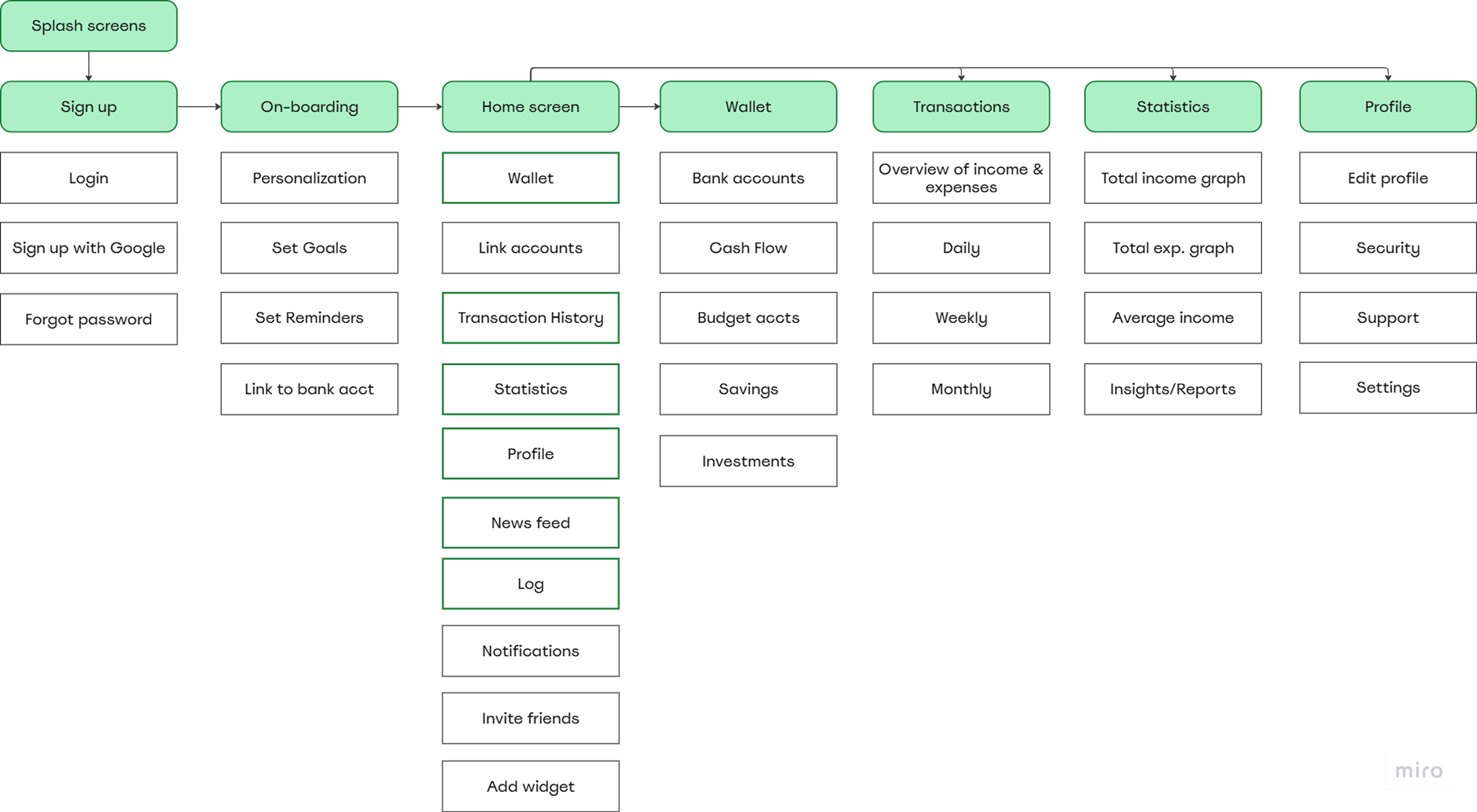
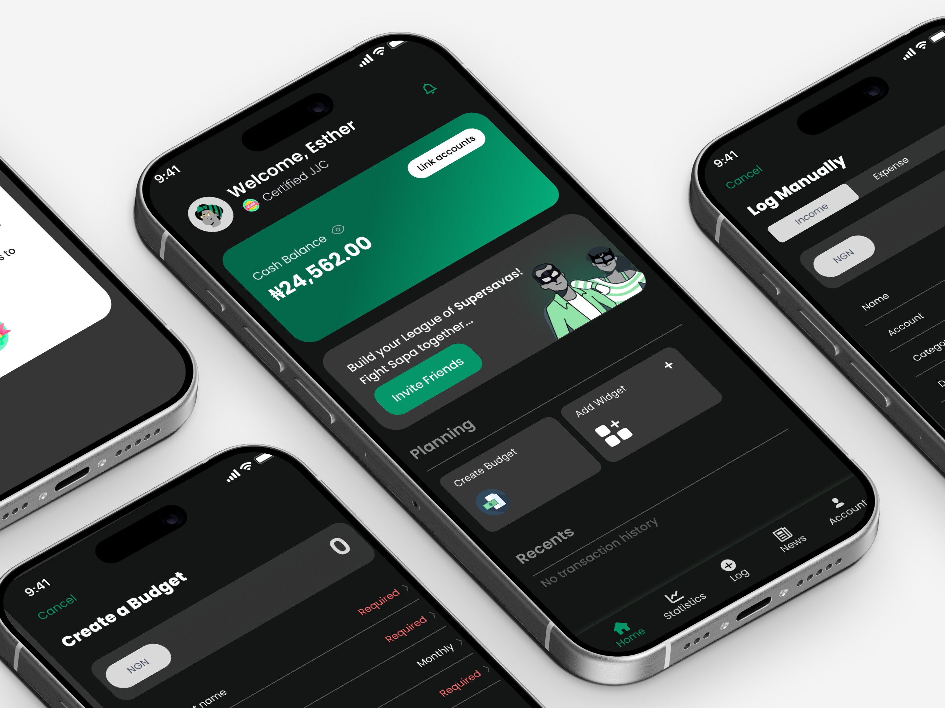
Wallet
Track income, cash balance, and linked accounts
Transactions
Log and categorise all spending in one view
Statistics
Visual reports and spending trend analysis
Profile
Savings goals, reminders, and personal settings
From architecture to screens
Wireframes were produced for every major flow before any visual design began, ensuring all layout and interaction decisions were validated at low fidelity first.
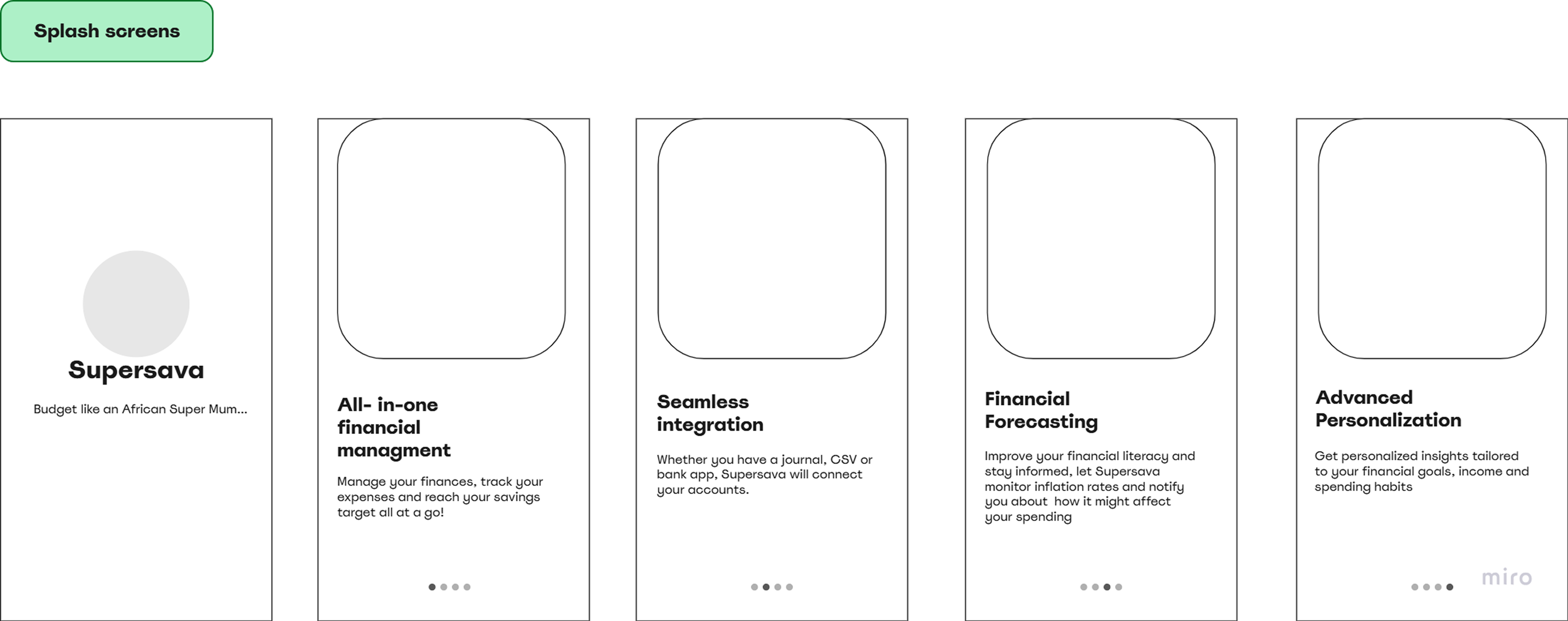
(a) Splash screens + Sign up / Login flow
Entry point screens and the full authentication journey, including account creation and returning user login.

(b) Onboarding personalisation
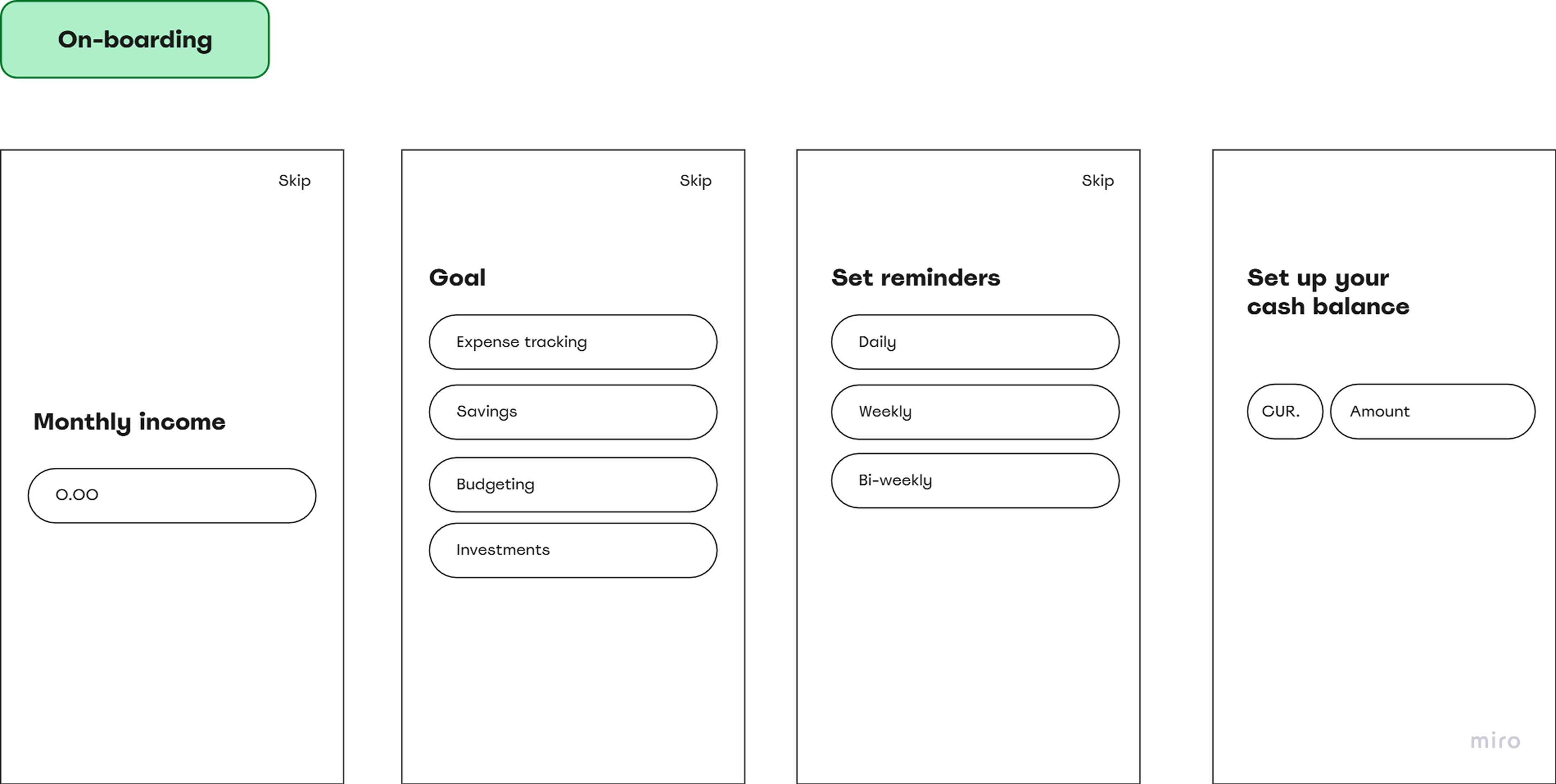
Monthly income setup, goal selection, reminder preferences, and cash balance entry — the personalisation flow that runs once on first launch.
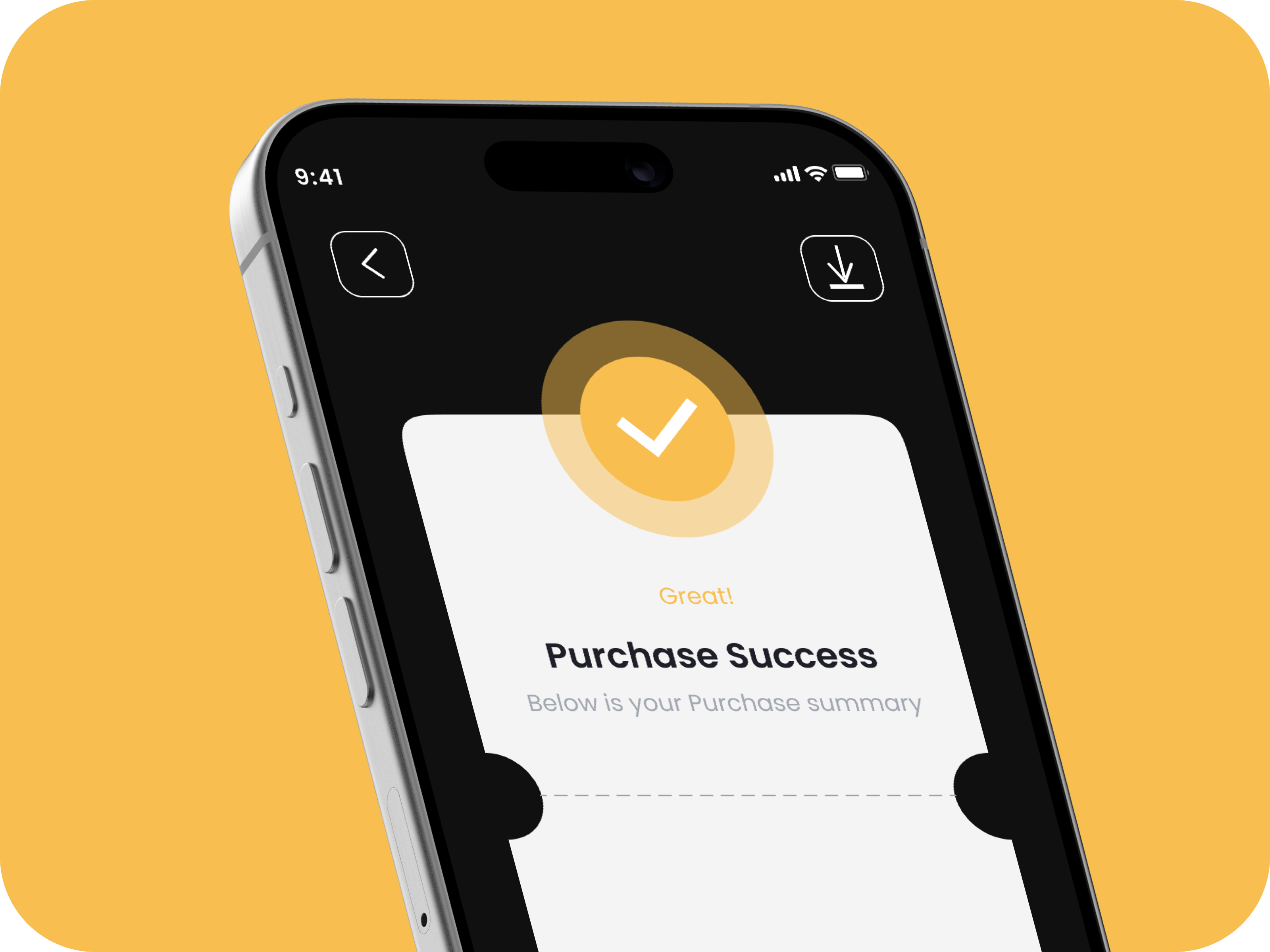
(c) Home screen
New user empty state, returning user populated state, quick transaction logging, and link account flow.
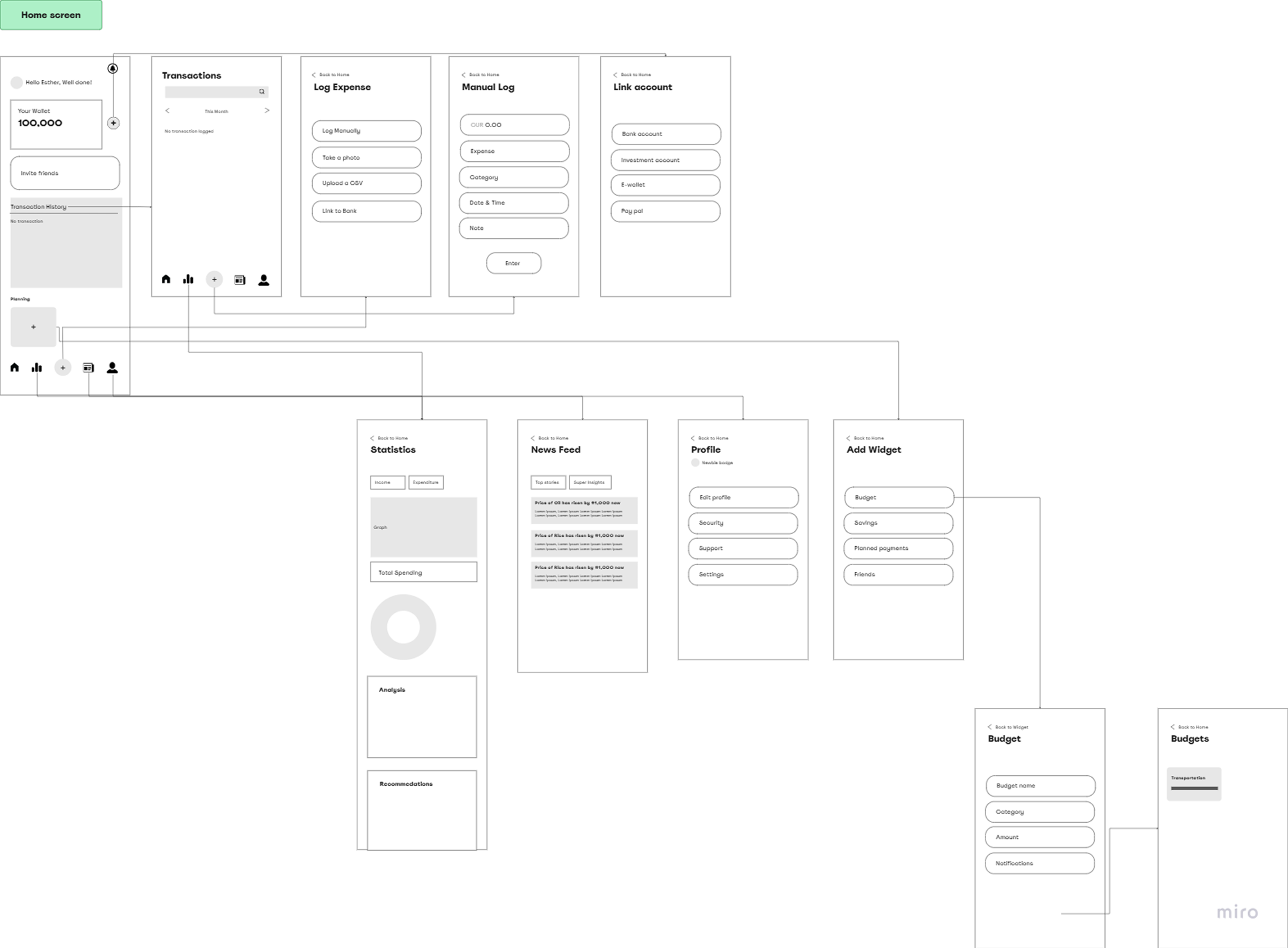
Every critical path, mapped

Designed for everyone, especially first-timers
Progressive Disclosure
Complex flows broken into manageable steps so new users are not overwhelmed by the full product on day one.
High Colour Contrast
Colours chosen to build trust while maintaining legibility across all text sizes and display conditions.
Consistent Interaction Patterns
Predictable layouts and interactions reduce cognitive load — especially critical for first-time users managing money for the first time.
What one week under pressure taught me
Speedy delivery teaches you what actually matters
This was a one-week concept test, which meant every hour counted. I couldn't over-design or second-guess — I had to make fast, defensible decisions and move. I learned that a well-reasoned wireframe beats a pretty screen with no thinking behind it.
Prioritisation is a design skill, not a PM skill
I used a risk/effort/payoff framework to score every proposed feature and decide what to execute immediately versus validate first. Saying no to good ideas so you can say yes to the right ones is something I now apply on every project regardless of timeline.
Two users in one product means two different design philosophies
Ada needs simplicity, encouragement, and no jargon. Tunde needs efficiency, depth, and automation. Designing for both without splitting the product required a flexible system — consistent patterns with adaptive content — and pushed me to think carefully about progressive disclosure.