Digital Asset Revolution
A WealthTech app bringing investment-grade gold to African investors — designed end-to-end across UX, interaction design, and marketing in a three-month contract.
$500M USD
Pre-seed raise supported
$18.5M USD
ARR at pitch stage
The Challenge
I was brought in as a contract UI/UX designer tasked with creating and prototyping designs for Lume's investors and developers.
#01
UX Design
#02
IXD Design
#03
Marketing
My Contribution
Wireframes (Web & Mobile)
High Fidelity Design
Prototyping (Mobile + Web)
Interaction & Motion Design
Micro-interactions on key flows
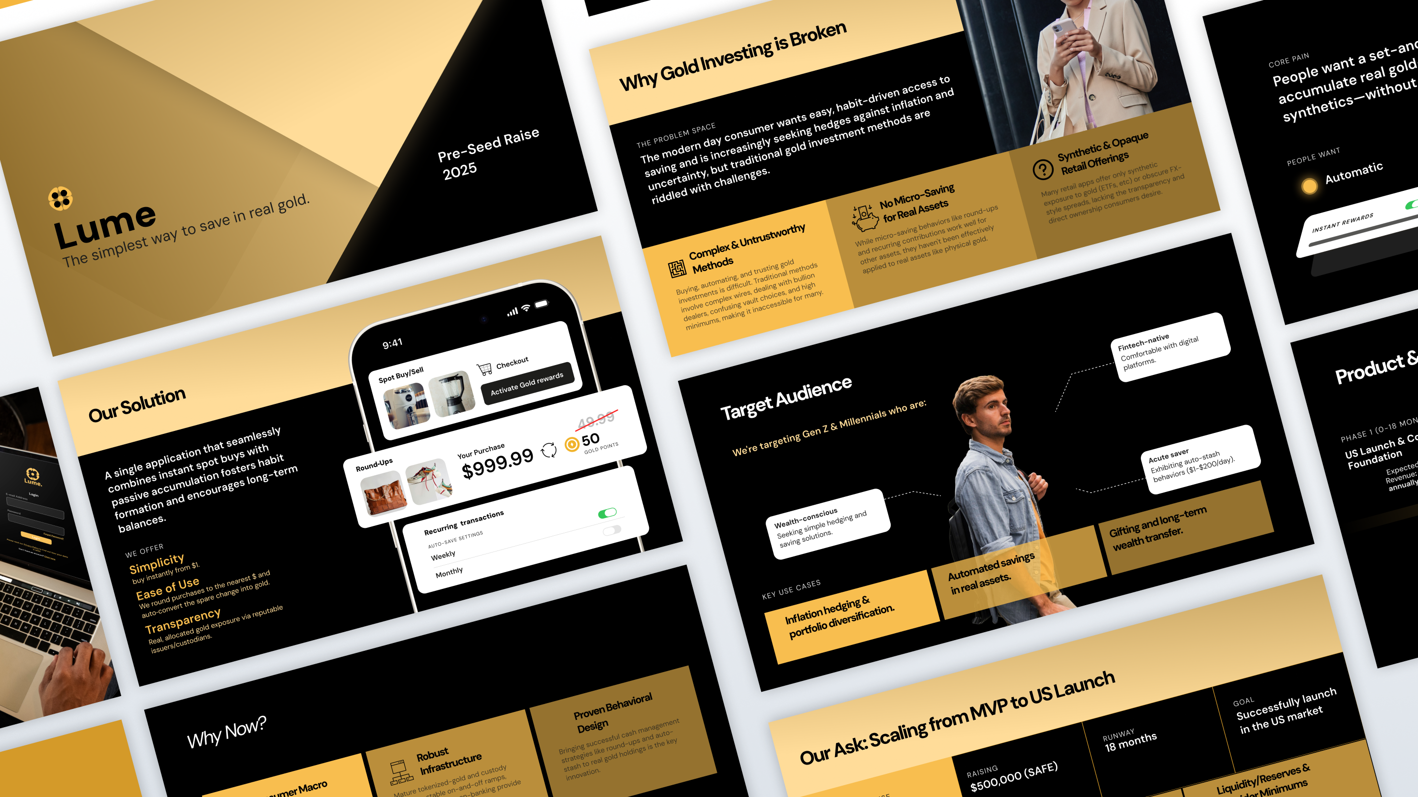
Investor Pitch Deck
UX Design
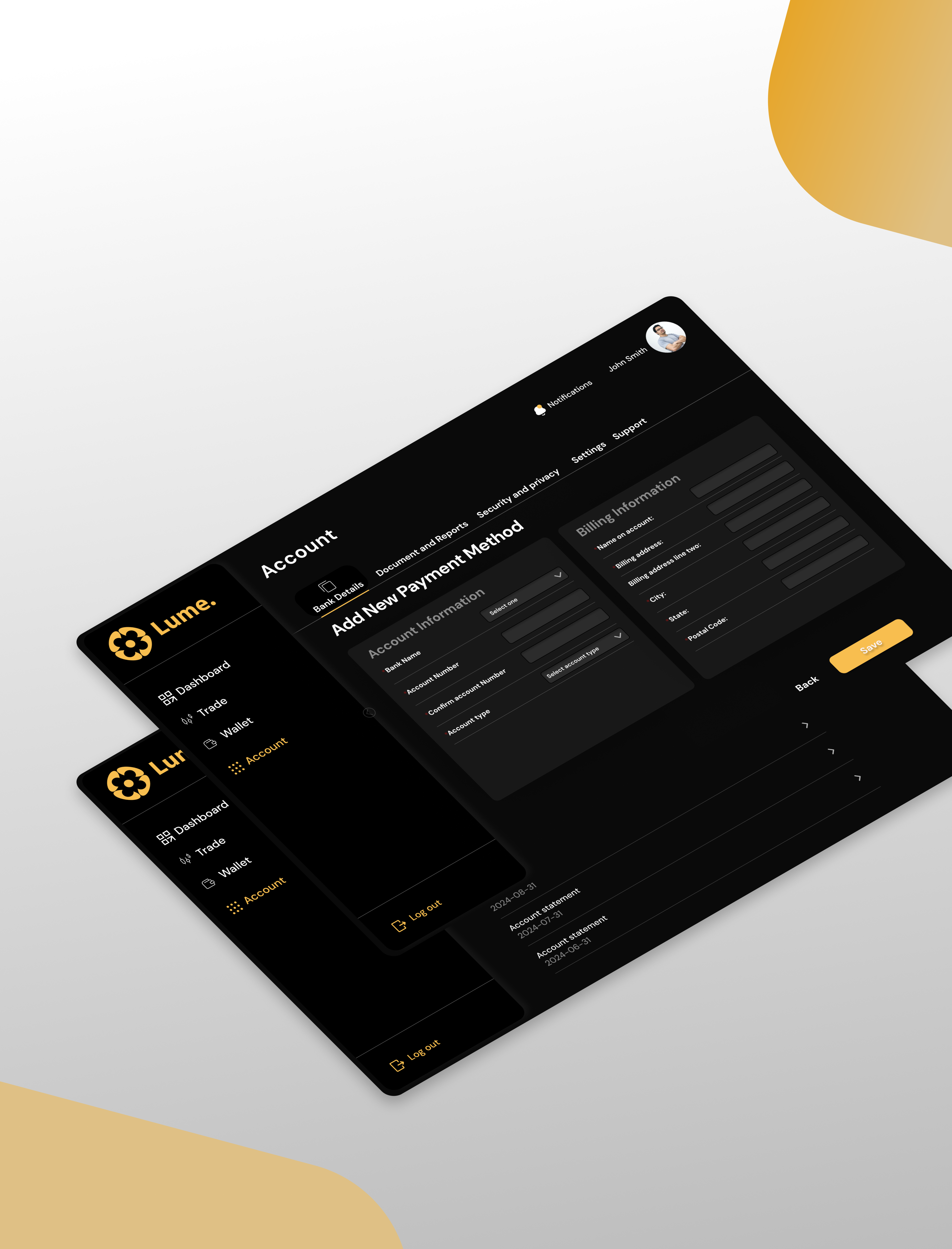
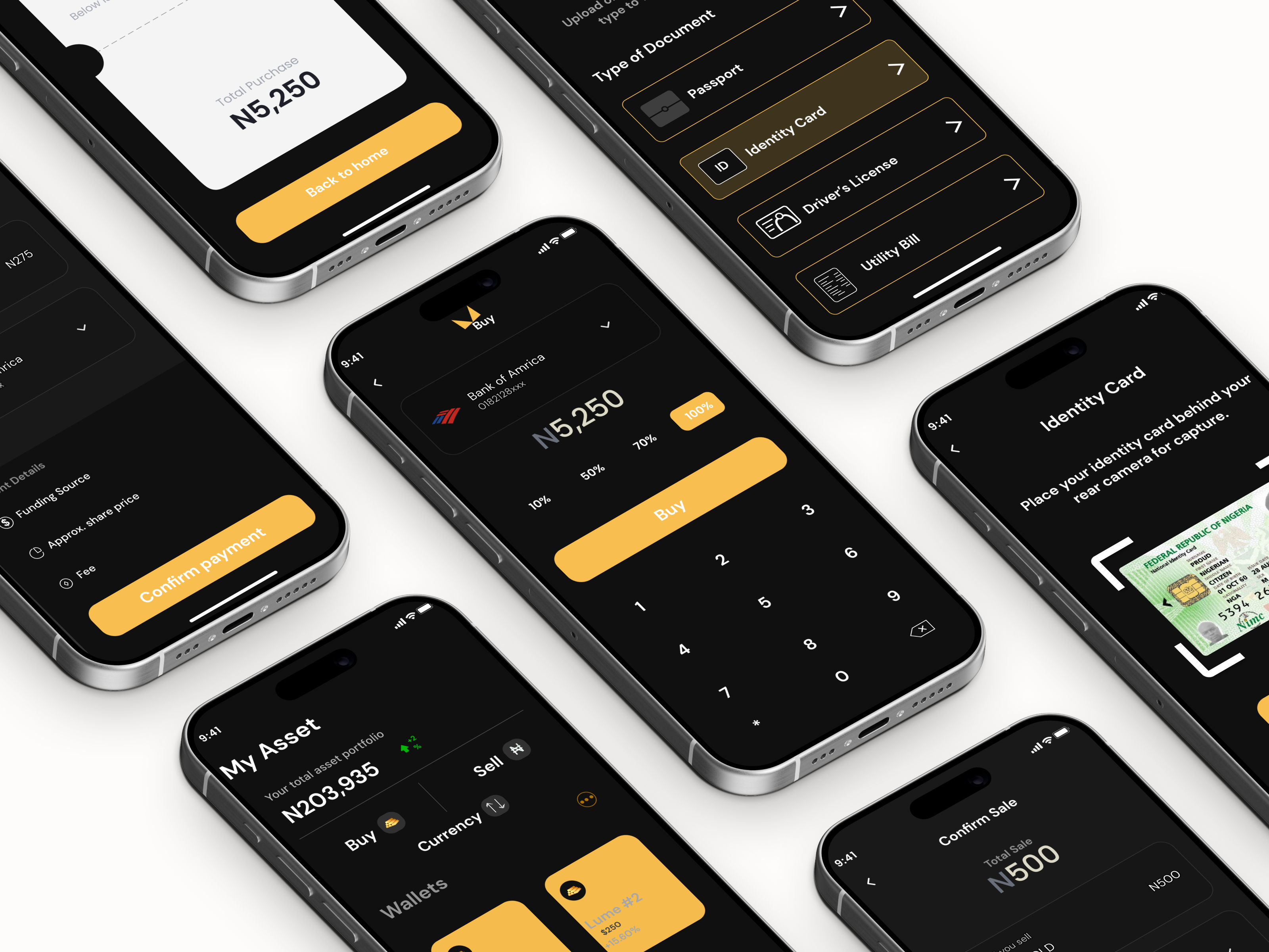
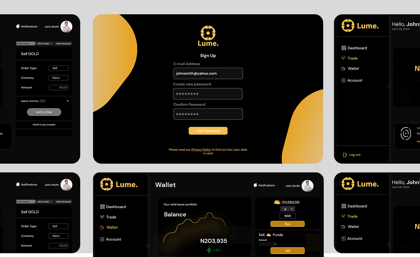
Wireframes — Web App
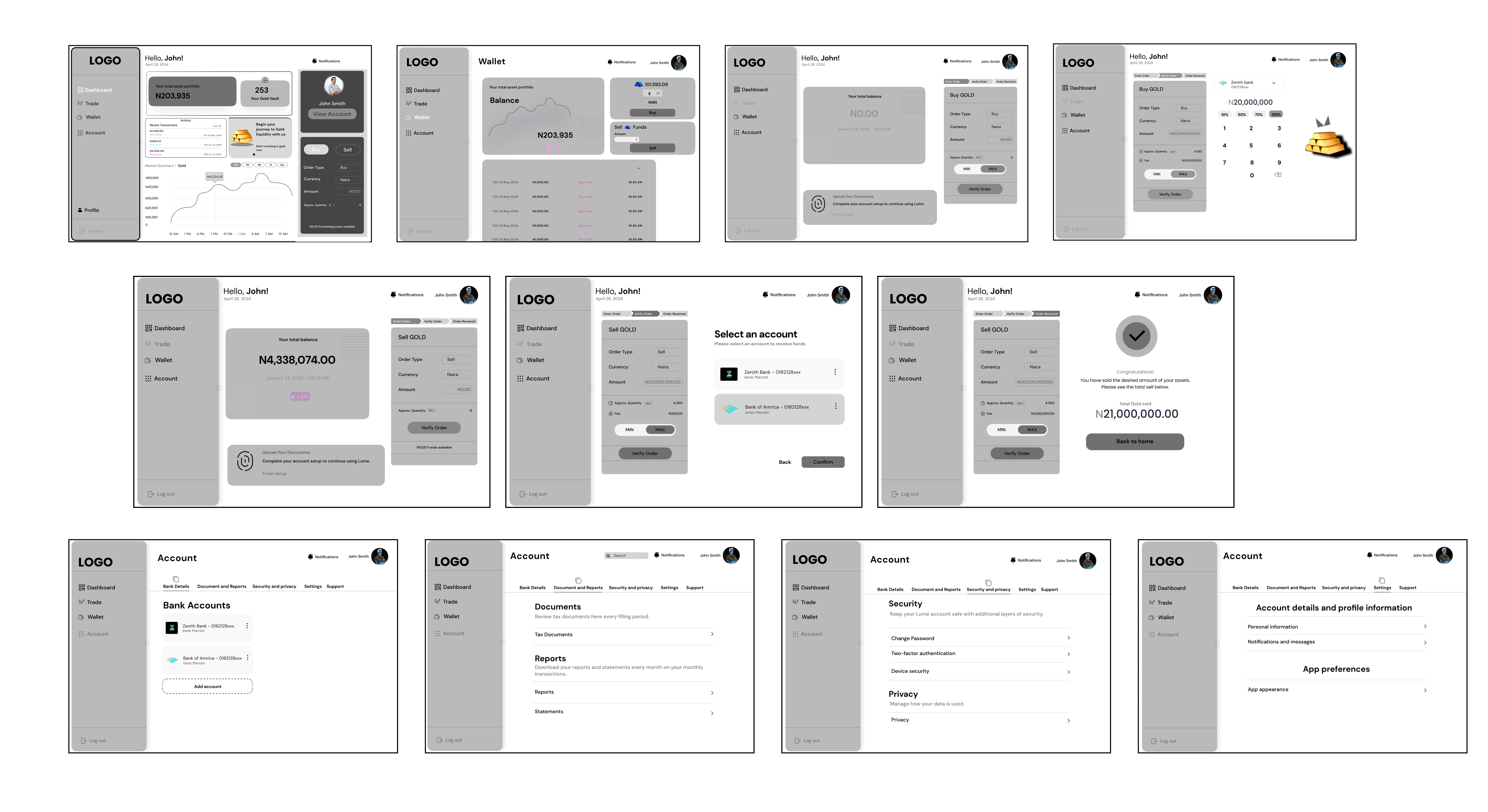
Dashboard
Wallet & Balance
Buy / Sell Gold
Account & Security
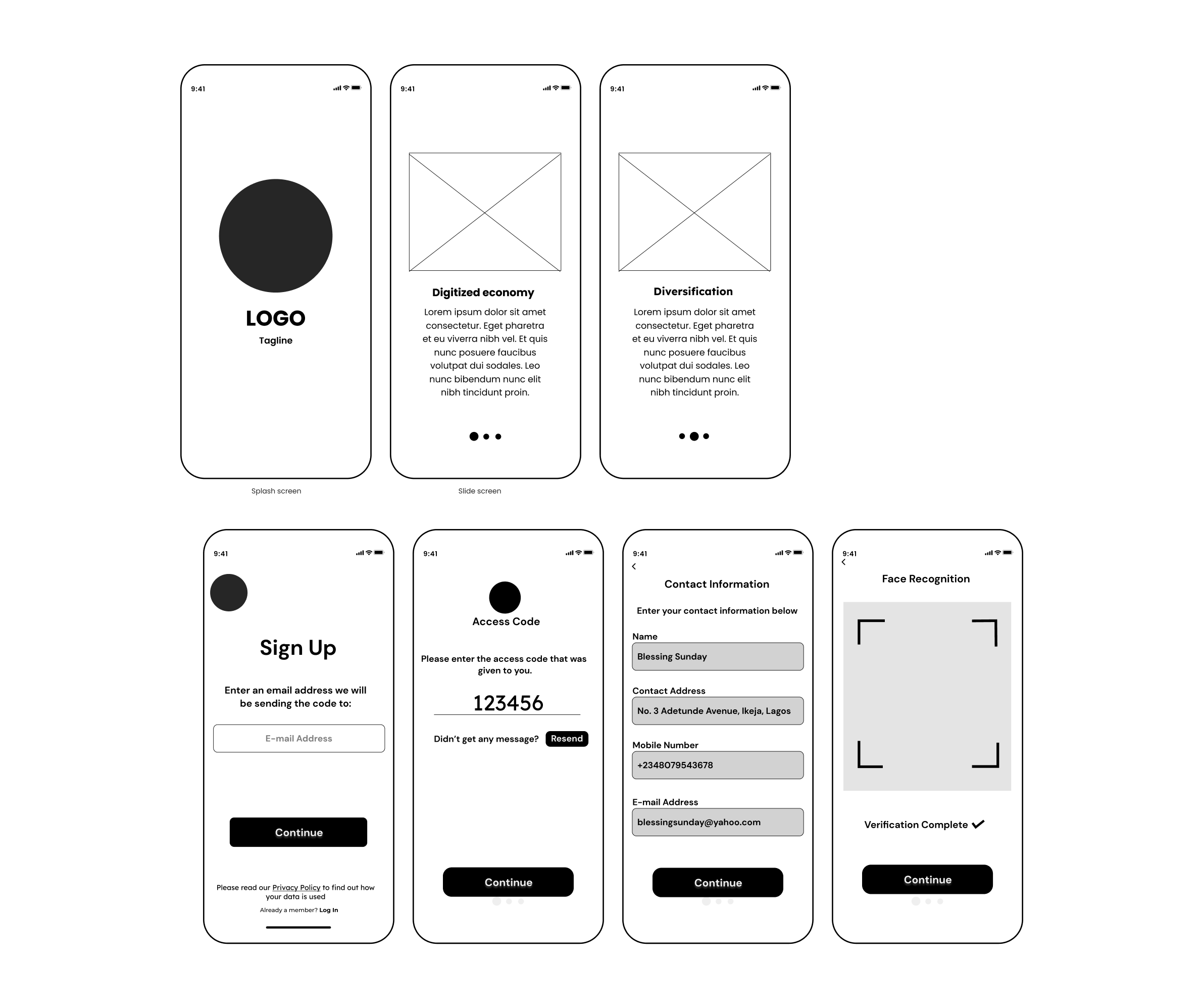
High Fidelity — Sign Up Flow
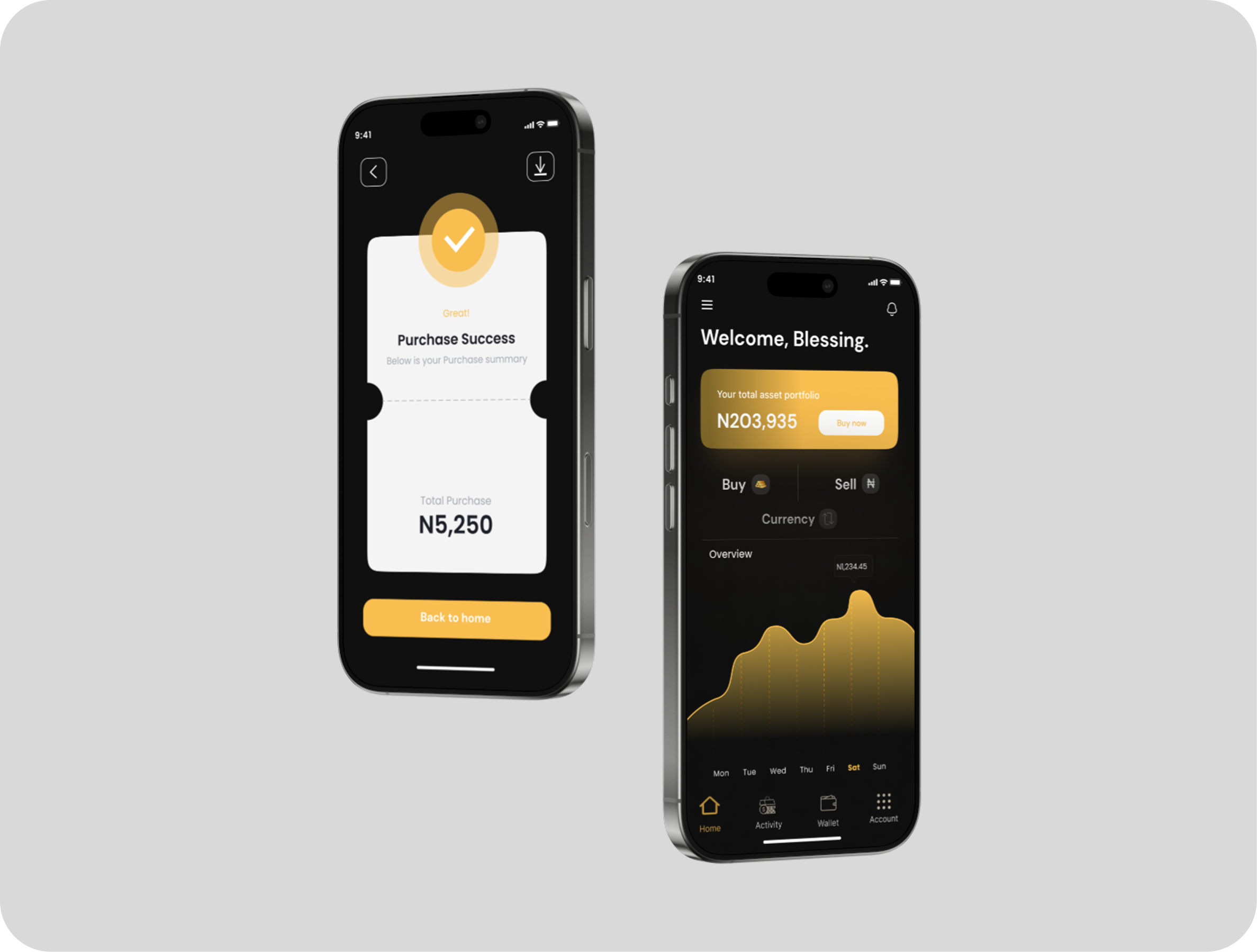
Sign up screens were designed to be easy and intuitive, containing micro-interactions upon user completion of each step — reducing drop-off anxiety in a financial onboarding context.
High Fidelity — Home & Profile
IXD Design
In-App Interaction & Motion Design
Why this animation exists
The logo animation plays on launch to give users a moment of orientation before the dashboard appears — reducing cognitive overload at the highest-friction moment.
Go-to-Market
Investor Pitch Deck
$500M USD
Pre-seed raise supported by pitch materials
$18.5M USD
ARR projected at pitch stage
Learnings
Balancing user and business expectations
Investors want visual sophistication. First-time gold investors need clarity and confidence. These goals pull in opposite directions. I learned to hold both by anchoring every screen decision in one question: does this reduce anxiety or create it?
Interaction design is communication, not decoration
The logo animation was not aesthetic — it gave users a moment to orient before hitting the dashboard. Well-timed motion reduces cognitive load the same way white space does. Every transition tells the user what just happened and what comes next.